Advanced layout is currently in beta. To have it enabled for your organization, contact Omni support.
- Visually group items inside containers to organize related charts, filters, and controls together
- Place filters and controls anywhere on the dashboard, not just the top bar
- Create multi-page dashboards with tabs so viewers can navigate between different views
Enabling advanced layout
Upgrading to advanced layout is permanent and cannot be reverted. We recommend testing on a duplicate of your dashboard first. To duplicate, click File > Duplicate.
Enable advanced layout
Click File > Use advanced layout… A confirmation dialog will appear explaining that this is a beta feature.
Containers
Containers are the building blocks of advanced layout. A container is a region on your dashboard that holds items and controls how they are arranged, including:- Chart tiles (query visualizations)
- Text and markdown tiles
- Filters
- Controls (field switchers, time frame switchers, etc.)
- Other containers (for nested layouts)
Naming containers
Each container can have a name to help you identify it while editing. To rename a container, select it and edit the Name field in the properties panel on the right side of the screen.Layout types
When you add a container to your dashboard, you choose between two layout types:Grid
Grid
Grid containers give you free-form positioning. Items can be placed at any position and resized by dragging their edges. This is similar to the classic dashboard layout but scoped to a specific area of your dashboard.Grid layout is best when you want precise control over where each item sits, such as arranging a set of KPI tiles in an exact configuration.To use a grid container:
- Click Add > Layout > Grid container
- Add items to the container (see Adding items to containers)
- Drag items to position them and drag their edges to resize
Stack
Stack
Stack containers arrange items in a single direction, either as a column (top to bottom) or a row (left to right). Items flow automatically and you control spacing and alignment.Stack layout is best for building structured sections like a row of filters, a column of KPI cards, or a sidebar with controls.Stack container settings:
- Direction -
column(vertical) orrow(horizontal) - Gap - Spacing between items
- Padding - Spacing inside the container edges
- Align - How items align perpendicular to the direction (start, center, end, stretch)
- Justify - How items are distributed along the direction (start, center, end, space between)
- Click Add > Layout > Stack container
- Add items to the container
- Configure direction, gap, and alignment in the properties panel
Adding items to your dashboard
Use the Add button in the toolbar to add tiles and layout items to your dashboard:- Charts - Add visualizations from your workbook queries
- Text - Add formatted text using Markdown
- Filter - Add interactive filters to control chart data
- Control - Add field controls to dynamically switch chart fields
- Layout submenu - Organize dashboard content with layout containers:
- Grid container - Create a container with grid layout for flexible positioning
- Stack container - Create a container with stack layout for linear arrangement
- Page navigation - Add navigation between multiple dashboard pages (available only when your dashboard has multiple pages). Page navigation is automatically added when you create a second page, but you can use this option to add additional navigation or customize placement
- Page - Add a new page to your dashboard (available only from the toolbar Add button)
Undoing and redoing layout changes
Only layout changes can be undone. This includes actions like adding, moving, or resizing containers and tiles, or adjusting container properties.
- Edit menu - Click Edit > Undo or Edit > Redo
- Toolbar - Click the (undo) or (redo) icons in the editing toolbar
- Keyboard shortcuts - Press
⌘Z(Mac) orCtrl+Z(Windows) to undo,⇧⌘Z(Mac) or⇧Ctrl+Z(Windows) to redo
History clearing
Your undo/redo history is automatically cleared when you make non-layout changes to the dashboard, such as:- Renaming the dashboard or tiles
- Editing filter configurations
- Updating query definitions
- Changing dashboard settings
Browsing items in the catalog
The catalog is a browsable library of all available items on your dashboard. Click the Catalog button in the toolbar to open it. The catalog displays items in three groups:- Controls & filters - All dashboard filters and controls, sorted alphabetically
- Queries - Chart tiles and query visualizations
- Text - Text and markdown tiles
New queries added to the workbook after the dashboard was created are not automatically placed on the canvas. Open the catalog to find them and place them into a container.
Adding items to containers
There are several ways to place items into a container:From the catalog
- Click the Catalog button in the toolbar
- Find the item you want to place (use search to filter by name)
- Click the item
- Select the target container from the placement menu
Using the properties panel
- Select the item you want to place on the canvas (a chart tile, filter, or control)
- In the properties panel on the right, click Place (for unplaced items) or Move (for items already in a container)
- A menu will appear showing all available containers
- Click the target container to move the item there
Drag and drop
You can drag items to reposition them within a container or move them between containers. This works for both grid and stack containers.- Within a grid container - Drag items to any position and resize by dragging their edges
- Within a stack container - Drag items up or down (in column direction) or left and right (in row direction) to reorder them within the stack
- Between containers - Drag items from one container to another, regardless of whether they are grid or stack containers. This lets you quickly reorganize your dashboard layout without using the catalog or properties panel.
- Containers that can accept the item show a colored outline when you hover over them
- Stack containers show a drop indicator line at the insertion point where the item will be placed
- The container you’re dragging from shows an outline to indicate the active drag operation
Unplaced items
Items that haven’t been assigned to a container will appear outside of the layout. Use the catalog or properties panel to place them into a container.Pages
Advanced layout dashboards can have multiple pages, creating a tabbed experience for viewers.Adding pages
To add a new page, click Add > Page. Each new page starts with an empty layout where you can add containers and items. Dashboards can have up to 15 pages. When you add a second page to a dashboard (going from 1 to 2 pages), Omni automatically adds page navigation to both pages so viewers can switch between them. If you add additional pages beyond the second, Omni copies the page navigation appearance from the previous page to maintain a consistent experience across your dashboard.Adding a page and its navigation happens as a single action. If you undo immediately after adding a page, both the page and its navigation will be removed together.
Duplicating pages
Duplicate existing pages in a dashboard to quickly create new pages with the same layout, containers, and content.- Click the Edit button on the dashboard to enter draft mode.
- Select the page you want to duplicate.
- In the container properties panel, click Duplicate page.
Copy to the original page name. For example, Dashboard Copy or Dashboard Copy 2.
If the dashboard is going from 1 to 2 pages and the original page doesn’t have page navigation, Omni will automatically add page navigation to both pages. If duplicating in a dashboard that already has multiple pages, the page navigation from the original page is included in the duplicate.
Switching between pages
While editing, use the page selector in the toolbar to switch between pages. Click the dropdown to see all pages and select the one you want to work on.Reordering pages
- Open the page selector dropdown
- Click Re-order
- Drag pages into the desired order
- Save your changes
Page navigation for viewers
When you create a multipage dashboard, Omni automatically adds page navigation to let viewers switch between pages. The page navigation widget renders as an inline page switcher that viewers can interact with. Page navigation is automatically added when:- You add a second page - When you add a second page to a dashboard, page navigation is automatically added to both pages
- You add subsequent pages - When you add a third or later page, the new page automatically receives page navigation matching the appearance of the previous page’s navigation
- You duplicate pages - When you duplicate a page in a multipage dashboard, the page navigation is included in the duplication
Customizing page navigation
You can manually add or customize page navigation at any time. To manually add page navigation to a page, click Add > Layout > Page navigation, then place it in a container where you want the page tabs to appear. This is useful if you want to:- Add additional page navigation widgets (for example, at both the top and bottom of a page)
- Customize the appearance or positioning of the auto-added navigation
- Add page navigation to a page that doesn’t have it
Filters
Advanced layout filters support additional display options beyond the standard dashboard filters.Displaying single select options as buttons
This section only applies to string filters.
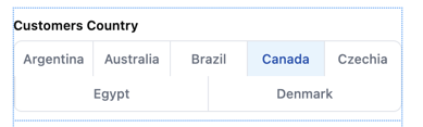
Inline
Displays inline with the dashboard content
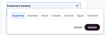
Popover
Opens in an overlay when clicked
Add and configure the filter
- Open a dashboard and enter draft mode by clicking Edit.
- Click Add > Filter to add a new filter.
- Configure the filter, clicking Done when finished.
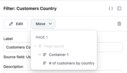
Move the filter into a container
Next, you’ll move the filter into a dashboard container. This is required to access the filter’s single selection options.
- At the top of the dashboard, click Catalog, then the filter. This will open the filter’s properties panel on the right side of the page.
- In the filter properties panel, click Move.
-
In the dropdown, select the container you want to move the filter to:
Configure single selection options
- If the filter properties panel is no longer open, click the filter to open it.
-
Configure the following fields:
- Filter type - Set to Single selection
- Filter control - Set to Button toggle
- Filter display - Select Inline or Popover
- Values - Define the options you want to include in the filter display:
- All values - Default. Up to the first 50 values for the filter column will display.
- Select exact values - Choose specific values to include. After selecting this option, a value picker will appear where you can check the values you want.
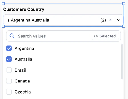
Displaying multiple selection options as dropdowns
This section only applies to string filters.
Add and configure the filter
- Open a dashboard and enter draft mode by clicking Edit.
- Click Add > Filter to add a new filter.
- Configure the filter, clicking Done when finished.
Configure multiple selection options
- If the filter properties panel is no longer open, click the filter to open it.
-
Configure the following fields:
- Filter type - Set to Multiple selection
- Filter control - Set to Dropdown. This is currently the only supported control type for multiple selection.
- The filter will automatically display inline with your dashboard content.
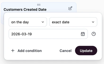
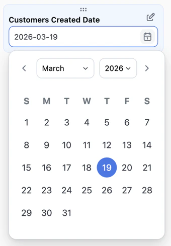
Date filter display options
When working with date filters, you can choose how the filter interface appears to users:-
Default - The standard date filter interface with range selection and preset options:
-
Single day - A simplified calendar interface that allows users to select a specific day. This is useful when you want to focus dashboard viewers on analyzing data for one date at a time, such as daily reports or date-specific snapshots.
Limitations
Advanced layout is in beta and has the following limitations:- Scheduled deliveries and downloads only render the first page during the beta period. If the dashboard has multiple pages, we will render the first one. Multi-page exports are in development and will be available soon.
- Maximum 15 pages per dashboard.
- Upgrading is permanent. Once a dashboard is upgraded to advanced layout, it cannot be reverted to the classic layout.